Handbook for version 1.9+
Topics from menu format configuration
Programa Integración de Tecnologías a la Docencia
Universidad de Antioquia
This format allows displaying the topics of the course by a menu. In order to select this format, you must go to the Administration block, click on Settings, and in the Format option select Topics in menu. To finish you must save changes by clicking the button placed at the bottom of the form.
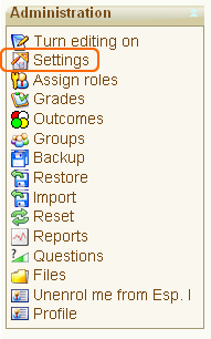
Figure 1. Administration Block
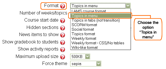
Figure 2. Topics from menu
After saving changes, you must turn the editing of the course on by clicking on the Turn editing on button placed at the right top of the page.
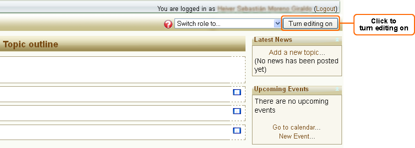
Figure 3. "Turn editing on" button
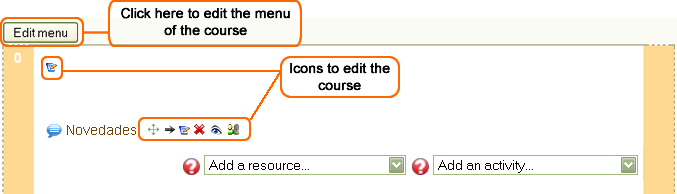
Figure 4. Editing icons
If you click on the Edit menu button, a set of tabs which contain different options to set appearance and content of the menu of the course will appear. On the Configuration tab, you can set the basic parameters of appearance and the menu functionality, on the tab Menu tree you can define the navigation structure that you want the menu to have, and on the other three tabs you can define the JavaScript code, CSS styles and HTML to modify the menu appearance.

Figure 5. Menu editing tabs
Every option included in each tab, and the explanation of their influence on the appearance and the behavior of the menu, are described below.
1. Configuration tab: In this tab you can define some options that will change the way in which the menu is displayed. Also you can enable the option Title of the topic as a template (we will explain this option later).
Menu configuration:
- Include default JavaScript: defines if the JavaScript functions that allow the menu to be floating will be included. We suggest you select Yes.
- Include default CSS styles: defines if the CSS styles for the menu are included. We suggest you select Yes. Additional to the default styles, you can change the styles using the tab CSS Styles template.
- Create from HTML template: the menu also can be created from a HTML template. If you select Yes, you must create your menu in the tab HTML template. If you want the menu to be floating or under dynamic structure, you must select Not. In the description of the HTML template tab, it is explained how this feature works.
- Menu position: defines the position in which the menu will appear in the course. The possible options are:
- Do not show: the menu is not created.
- Left: the menu is created vertically in the left block column.
- Middle: the menu is created horizontally as a bar in the middle of the course, over the topic section.
- Right: the menu is created vertically in the right block column.
- Keep links on submenu roots: defines the behavior of the menu options that work as roots or parents of a submenu. If you select Yes, the menu item works as a link to click on it and open the URL that is defined in the Menu tree. If you select Not, the menu item displays the son links to click on it.
- Display navigation: this option allows placing the next and previous links to make easier the navigation by the modules. The possible options are:
- Top: the links will be placed on the top of the module.
- Bottom: the links will be placed on the bottom of the module.
- Top and bottom: the links will be placed on both, top and bottom of the module.
- Nothing: if this option is chosen, no links will be displayed to navigate through modules.
- Navigation nodes: in this box is entered the sequence or order desired for the navigation when is checked any of the options which allows inserting the next and previous links in each module. i.e. if you enter the sequence 1,5,4,3,2,1 , you will be saying that it is desired that when clicking on the link next, this points to the module 1 and if clicking again on this same link, this points to the module 5 and so on. To repeat this order again, you must enter the first number at the end of the sequence, like in the example. Each number must be separated from the other one by a comma and with no space.

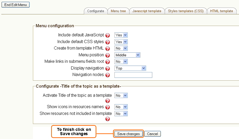
Figure 6. Menu configuration
Functionality configuration – Title of topics as a template:
These options allow the titles of each topic to be used as a template to change the appearance of such topic. The main advantage of this option is that allows placing the resources and activities in any position of HTML content, instead of having a vertical view as Moodle usually displays them. Later, in this handbook, you will see how it works with this functionality.
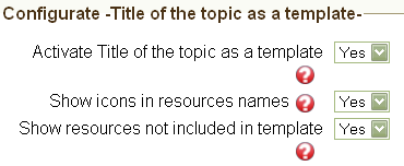
Figure 7. Configuration of functionality
2. Menu tree tab: In this tab you can create the navigation tree which will be composed by links to specific topics or to external URLs.
Configure topic tree:
The menu is based on a tree structure where each branch or tree’s sheet can be associated to an URL. The URLs can be external or linked directly to a topic of the course. When you sign in for first time to configure the topic tree, the platform suggests a lineal structure, without branches, with a quantity of sheets equal to the number of topics of the course.
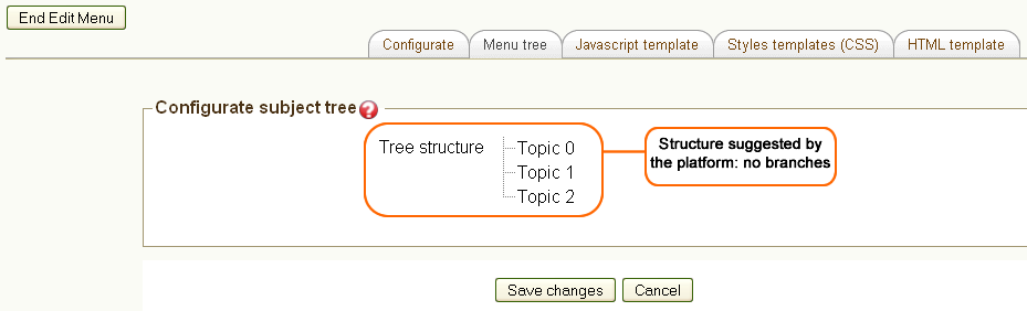
Figure 8. Strcuture without branches
To change the sheet properties, click on its name whereupon appears a window in which you can make some actions such as moving the sheets, deleting the selected sheet, creating a new sheet or updating the sheet data.
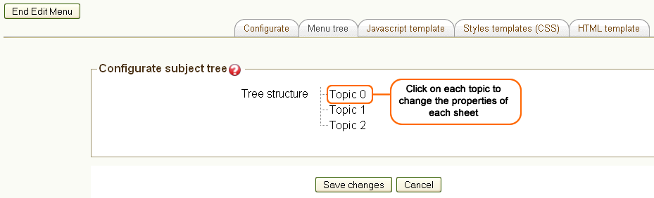
Figure 9. Click to change the properties of the sheets
When you click on the topic or on its name, a window like next one appears:
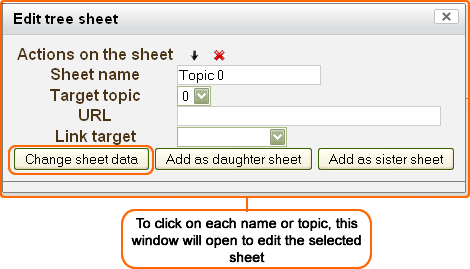
Figure 10. Editing window
Among the actions that you can do on the sheet are:
- Move a sheet to left: select the arrow that point out to left. It converts the sheet in sheet’s sister that contains it (parent sheet). It is only available if the sheet is son of another sheet, never when it is placed in the main branch.
- Move a sheet to right: select the arrow that point out to right. It converts the sheet in son of the previous sheet. It is not available for the first sheet of the main branch.
- Up a sheet: select the arrow that point out to up. It modifies the order of a sheet, placing it before its brother immediately previous. It is not available for the first sheet of a branch.
- Down a sheet: select the arrow that point out to down. It changes the order of a sheet, placing it after its brother immediately below. It is not available for the last sheet of a branch.
- Delete a sheet: select the X. It deletes the selected sheet and all the sheets contained on it.
- Sheet name: you must write here the name or tag that appears for that sheet in the menu. It is also used to reference the position of a sheet in the HTML template. In the example of the figure 10, the sheet name will be General information.
- Target topic: If the sheet is used as reference to a course topic, this option indicates what topic will be selected. If a topic is selected, it could not define later an external URL at which direct the link of the option in the menu. In the example of the figure 10, the target topic was 0. It is important to keep on mind that each topic is identified by a number depending on the order in which they appear, and if for any reason the order of the topics is modified, for example using the topic format for the course, or some of them is deleted, the positions change and the links remain directing to the topics according to the new numbers.
- URL: indicates an URL to which the menu option will make reference. It only can be specified if a target topic was not selected.
- Link target: indicates if you want to open the link, being the topic or the external URL, in a new window or in the same window. If you do not select an option, the link will open in the same window.
The option Add as a daughter creates a copy of the selected sheet and adds it as a daughter of it.
The option Add as a sister creates a copy of the selected sheet and adds it as a sister of it.
The option Change sheet data save the values associated to the properties of the selected sheet.
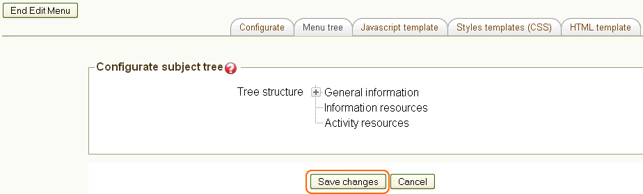
Figure 11. View of the tree structure
Once you have finished the tree, you must click on Save changes. The tree changes are temporary, if they are not saved and another tab is selected or the page is closed, all changes will be lost.
With the basic configuration, if you disable the course edition, you can see the menu of the course at the middle top of the page, as the following image shows.
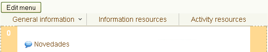
Figure 12. View of the course
When you pass the mouse over each option, the menu is dropped.
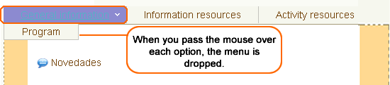
Figure 13. View of the menu list
3. JavaScript template tab: In this tab, you can add a JavaScript code that will act in the menu or in the page. It can be useful to define additional behaviors for the menu or to define a menu structure different from the default structure. However, it requires programming knowledge to make this kind of changes.
JavaScript fonts:
If the default JavaScript is disabled, in the option Configuration you can add a code that manipulates the menu tree information and build a new menu. For example, the following code uses the functions of the YUI library, included in Moodle to create a simple menu bar, similar to the default menu but without any effect on the movement of submenus:

|
Notes:
* The name id_contenedor_menu corresponds to the div identifier that contains the menu in HTML created as nested lists, generally with the HTML tags: ul and li. * When the default JavaScript is included, the variable tree_menu_var contains the object JSON with the menu data. * For more information about the JSON’s structure and how customize the menu, see the YUI’s reference manual following this link. |
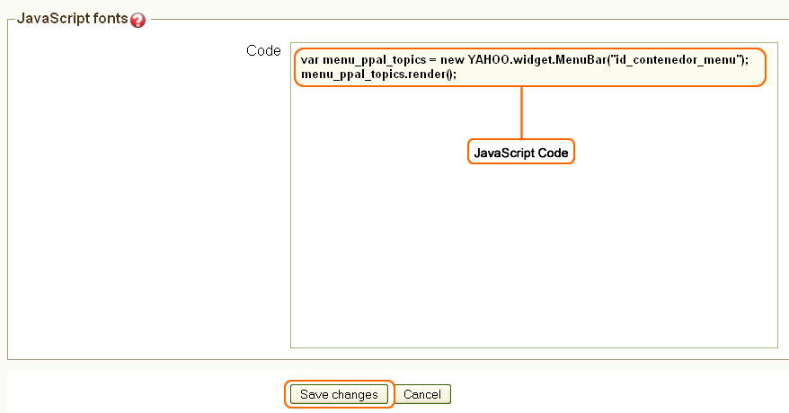
Figure 14. JavaScript code

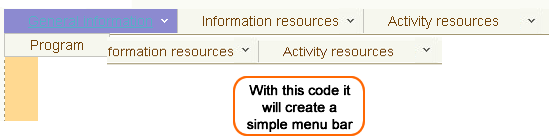
Figure 15. View of the menu with JavaScript code
4. CSS styles template tab: it can include CSS styles in which you can define a customized graphic appearance for the menu. If you want to custom the popup menu, it is suggested to keep the default styles and to make the changes by overwriting those styles, because it can be a little complicated defining all the styles for the popup menu if default styles are disabled.
CSS styles: a simple example of using the styles template is writing the following code in the CSS code window:
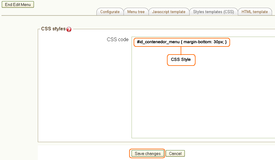
Figure 16. CSS code
With that code, the menu is separated 30px from the main topic or from the first block, according to the defined position for the menu.

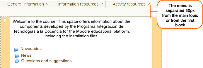
Figure 17. View of the menu with CSS code
5. HTML Template Tab: you can also create the menu from a HTML template. For do this, you must verify that in the tab Configuration, the option Create from HTML template is selected as Yes. Then go back to the “HTML Template” tab.
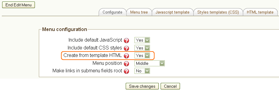
Figure 18. Option Yes HTML
When the HTML template is used, popup menu is not generated, but instead, the HTML is used to replace the tags that define the position of each menu option in HTML. A tag is a keyword entered in HTML and replaced at the time of showing the menu by a value defined according to the construction of the tag. The possible tag types are:
- Link to a menu option: It is useful for entering a link as a text, according to the configuration in the menu tree. The tag structure is [[name]], where name is the name assigned to the menu sheet in the tree. The same sheet name is used as a word to generate the link.
|
Note:
|
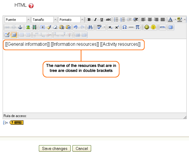
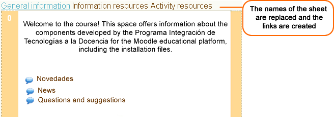
Figure 20. View of a Link to a menu option
The figure 21 shows an example of links with the option Link URL, where Edit a web page and Forums are sheets of the menu tree. In the figure 22, you can see how these options will be displayed at the time of passing the course. You can see the URL appears as a text, this option would be very useful if it is entered as direction of a link, i.e. turning an image into a link to a topic.
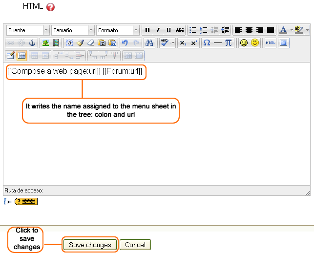
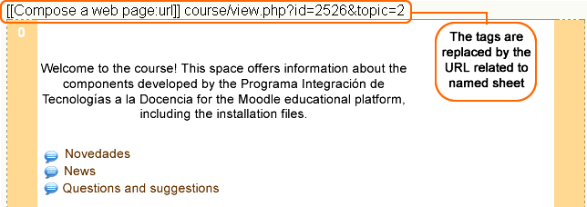
Figure 22. View of Link URL
Functionality configurations - Topics titles from templates:
The objective of using the topics titles to define templates is to give an especial presentation to each topic, by using different resources offered by HTML. With this functionality it is possible to locate Moodle activities or resources within a module of content. For example, you can put the link to a forum, a glossary, a directory, etc., without copying the specific URL. Among other advantages, there is the possibility of taking the course to other platforms without problems with the addresses, and properties like the established to resources of web page, remain in the links.
Remember that parameters to control this functionality are in the tab Configuration:
- Activate Title of topic as a template: allows the title of a topic to be considered as a template for the construction of the topic.
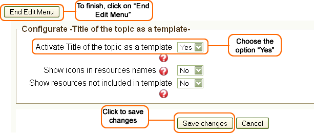
Figure 23. Configurations of functionality
When you click on the End Edit menu button, you come back to the main page of your course, and there you must click on the Edit summary icon, placed at the left top of the module.
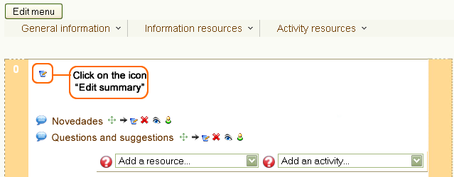
Figure 24. Edit Summary icon
The HTML editor will be open and there you must write a text including the module resource names. The modules names must be closed in double brackets, i.e. [[Objectives]], so the resources names will be replaced by a link.
When you finish, click on Save changes.

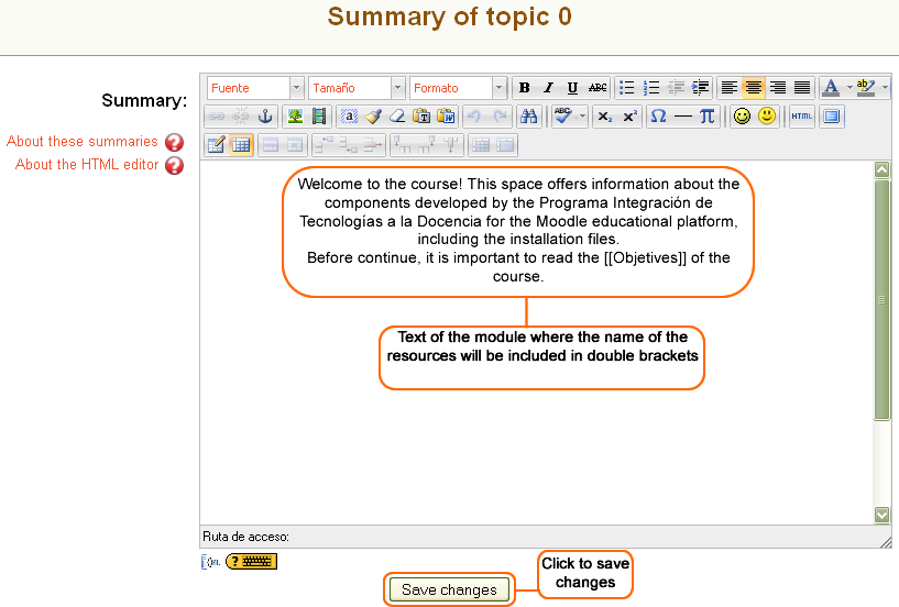
Figure 25. Text
You can see in the figure 26 the resources names are turned into links. If you want to see each one, just click on them. To see the process of the course click on the Turn editing off button, placed at the right top or by using the Administration block.
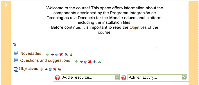
Figure 26. View of the course Topic from template
When the editing is disabled, you can see that listed resources are hidden and just those which are in the title are displayed.
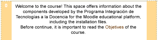
Figure 27. Resources within the text
To continue with the explanation about configuration options, you must click on the Turn editing on button, and then on the Edit menu button.
Second option for this functionality is:
Show icons in resources: if it is defined as Yes, links to the resources that are in the title of the topic are preceded by the icon which identifies them in the platform. This is a useful graphic element to identify the resource type. If it is defined as Not, just the link to the resource is entered.
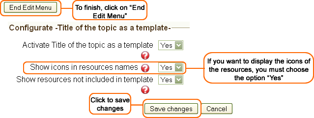
Figure 28. Click on "Yes" Show icons
To see the changes, you must click on the Save changes button, and then on the End Edit menu button.
You can see in the figure 29 that if you enable the option Yes, every resource is displayed preceded by the icon by which it is represented.
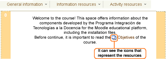
Figure 29. View of the course with the option Show icons
The last option for this functionality is:
- Show resources not included in template: when Yes option is selected, the resources which are not included in the title of the topic (used as a template) will be displayed with the same title as they usually appear in Moodle. If Not option is selected, just the resources are displayed in the title of the topic if they have been included in it. Remaining resources only can be visualized by the user when editing mode is turned on.
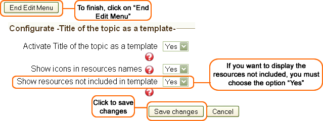
Figure 30. Click on 'Yes' Show icons not included in template
If you choose the option Yes, not included resources in the template will be displayed with the same title as they usually appear in Moodle.
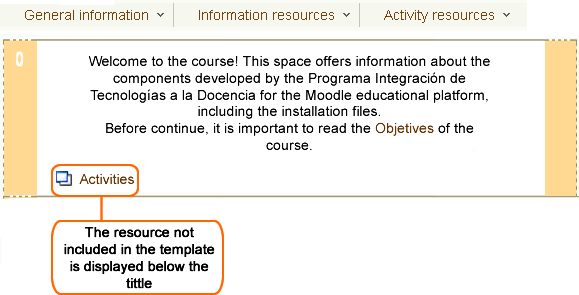
Figure 31. View of the course, resources not included in template
|
“Turn editing on” button